We’ve revamped the button editing panel to deliver a cleaner interface and introduced powerful new customization features, including a full theme gallery to elevate your form design.
What's New
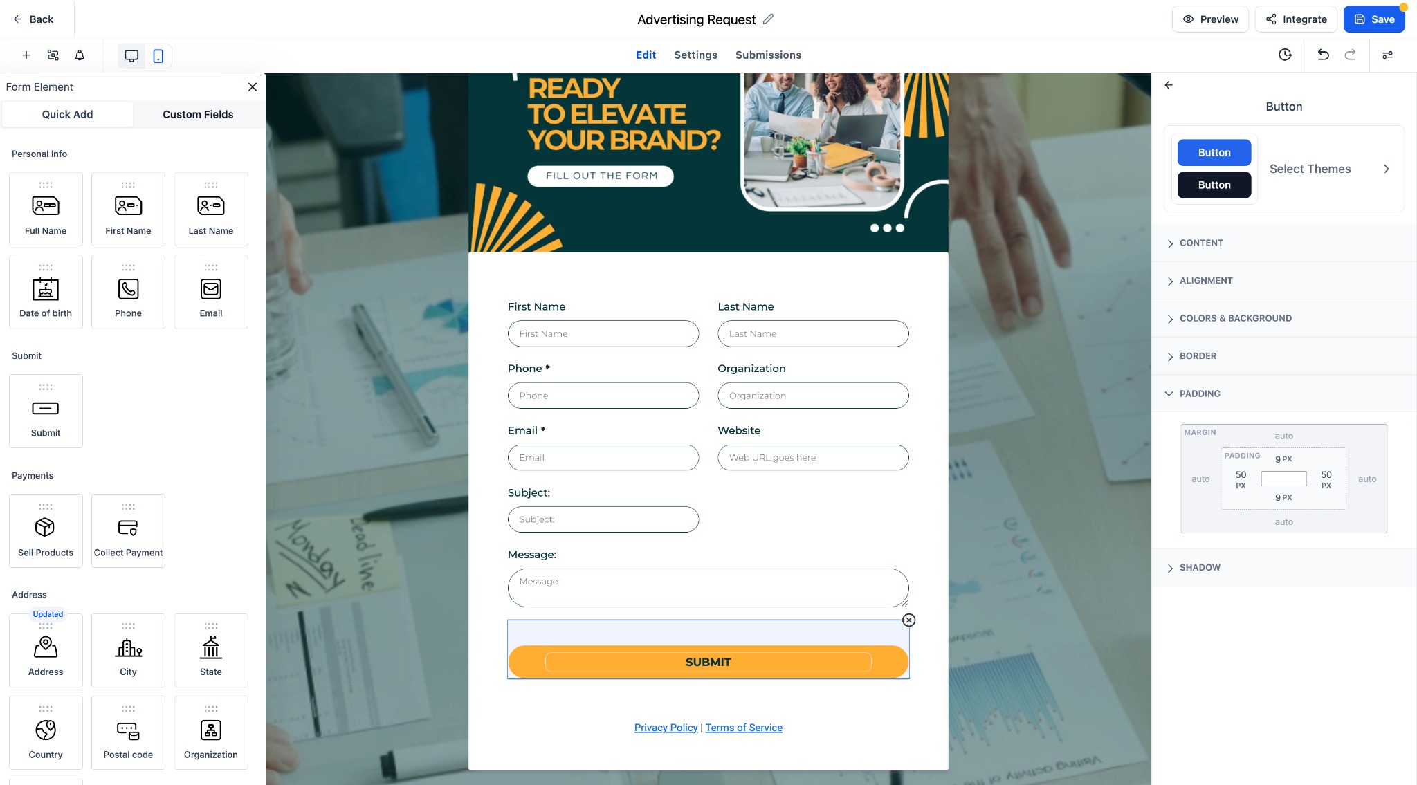
Redesigned Button Editing Panel:
A structured, user-friendly layout for easier styling and faster navigation.New Theme Selector:
Choose from a curated set of button themes, including Filled, Border, and Text Only options.Live Preview:
Instantly see how each theme and style change will look in your form.Grouped Styling Options:
Controls for font, color, alignment, border, padding, and shadow are now logically organized into collapsible sections.Key Highlights
- Faster editing with clearly organized style categories.
- One-click theme application from a diverse collection of button styles.
- Support for custom fonts, font weights, and responsive design elements.
- Full-width toggle and corner radius controls for more flexible layouts.
How It Works
- Select any form button to open the styling panel.
- Edit text, layout, and appearance using the updated panel sections.
- Click "Select Themes" to browse and apply pre-built button styles.
- Customize further with font, spacing, and shadow controls.
Notes
- All prior customization options are preserved and now easier to access.
- Themes serve as a starting point and can be fully tailored to your design needs.
- Great for improving form engagement and maintaining brand consistency.
Let me know if you'd like this version in a markdown format or formatted for another platform.


Was this article helpful?
That’s Great!
Thank you for your feedback
Sorry! We couldn't be helpful
Thank you for your feedback
Feedback sent
We appreciate your effort and will try to fix the article